


Data in a table is useful. Data in a chart lands differently with business users.
Pega report definitions support 12 chart types out of the box – bar charts, column charts, pie charts, gauges, sparklines and more. The most commonly used in real projects are column charts and pie charts. Here is how to set them up.
The One Thing You Need First
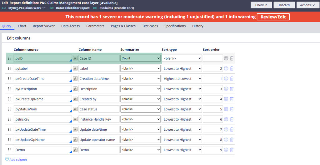
Before you can add a chart to a report definition, you need at least one aggregate numerical column in your query. The most common one is count – for example, counting the number of cases by status.
Go to the Query tab, add an aggregate function (count) to your pyID or case ID column and save. The Chart tab will then allow you to include a chart.
Setting Up a Column Chart
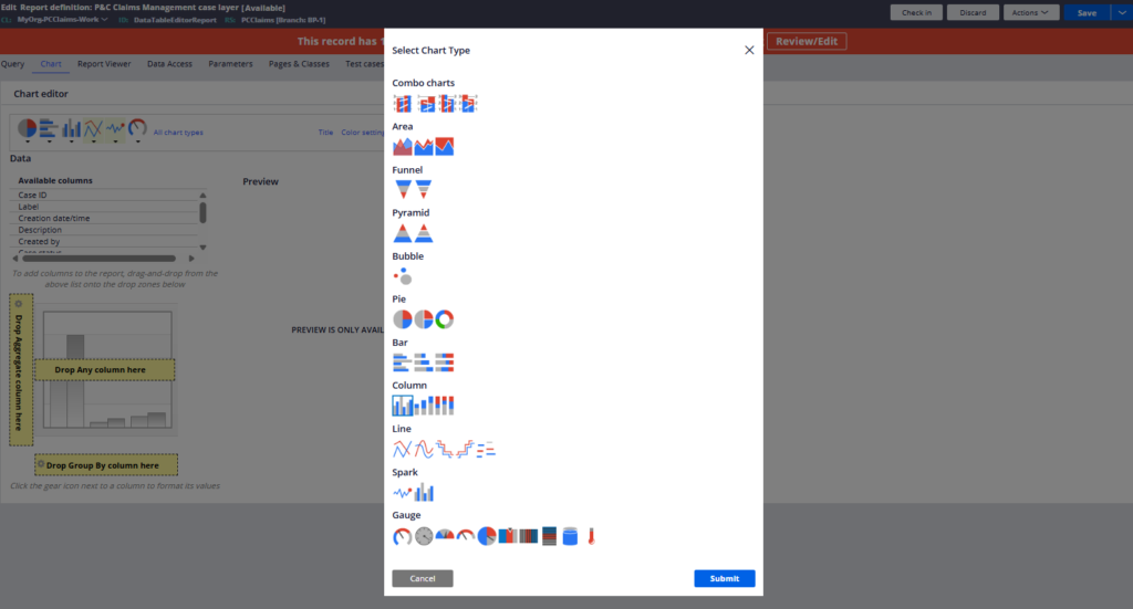
Column charts are the default and the most versatile. Once you click Include Chart on the Chart tab, the chart editor opens. Select Column Chart from the list of available types and submit.
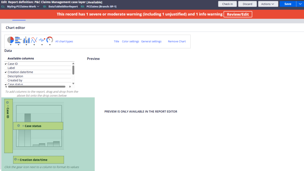
From there it is drag and drop. The aggregate column – your count of cases – goes into the Values area. The column you want to group by – say case status – goes into the Group By area. If you want to break down results by a second dimension, like which operator created the cases, drag that into the Series area.
Save and run. The chart renders immediately in the report viewer alongside the data table. From the viewer you can also save the chart as an image or download it.
Pie Charts
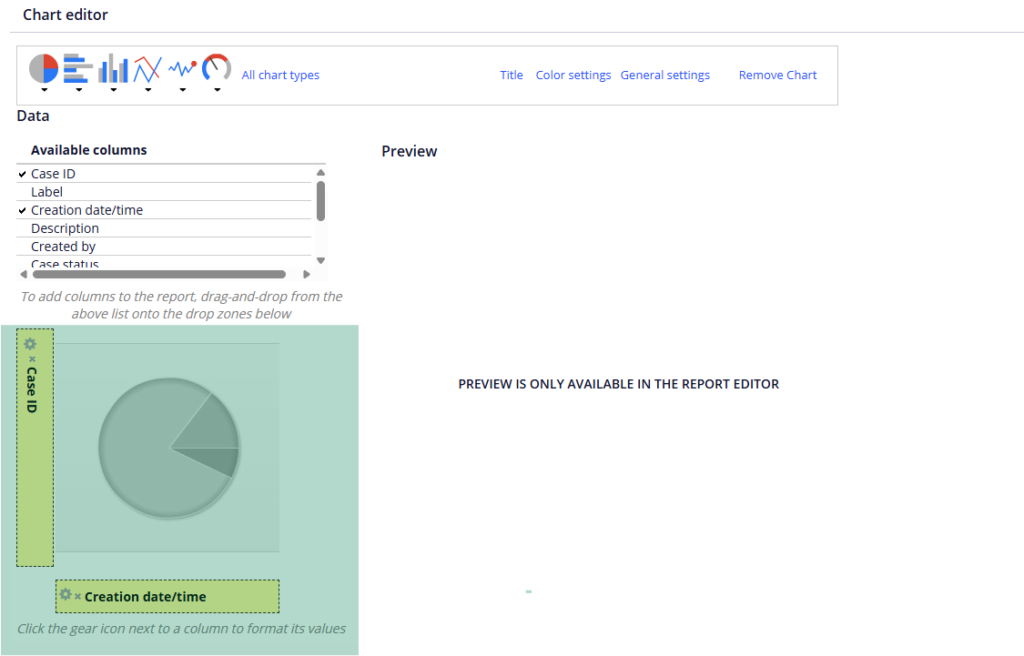
Pie charts need two things – the aggregate column and one grouping column. Drag the count into values and the grouping column – status, operator, customer type – into the segments area. Clean and simple.
Colour and Formatting Options
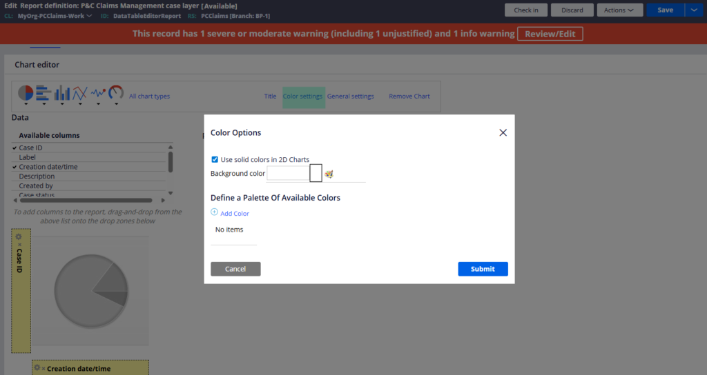
You can configure chart titles, legend position, background colours and the general palette from the chart configuration panel.
One feature worth knowing is conditional colours. You can define rules – when a specific value matches a condition, that segment or bar renders in a specific colour. For example, when the customer ID is a specific value, show it in black. This is useful for highlighting exceptions or specific categories that need attention.
The slider option is worth enabling when you have a lot of data points – it lets users scroll through a wide chart without the visual getting too cluttered.
Watch the Full Walkthrough
In the video below I walk through adding a column chart and a pie chart to a report definition, configuring grouping and series, applying conditional colours and running the report to see the charts rendered live.
Charts in report definitions are something business users genuinely appreciate. A well-configured column chart communicates the same information as a data table in a fraction of the time – and it gets far fewer follow-up questions.