Add a Pega Icon Font in Traditional UI
In this blog article, we will explore how to use a custom icon font in your Pega application.
This tutorial is only applicable for Traditional UI based applications (UI-Kit & Theme Cosmos based).
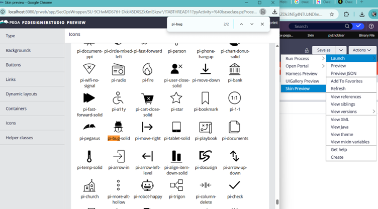
Use Case – When we started building the SecOps Studio – The cybersecurity product for Pega, we came across a use case where we needed to use an icon class to display the OWASP Top 10 Navigation in our security Portal.
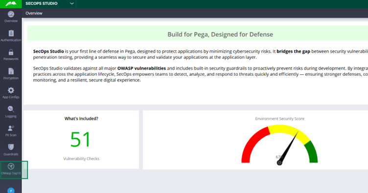
The below picture was our earlier representation on OWasp navigation.
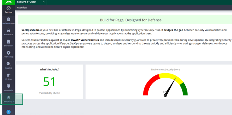
If you look carefully, the icon we used was a Bug but not a Wasp. We want to actually use the official OWasp icon but this icon was not available OOTB.

So this is our requirement and in this tutorial, we will see the different steps in achieving this use case.
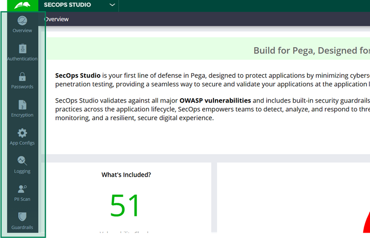
Let’s take a step back. If you take another look at the SecOps studio, there are different icons configured which are not custom icons.
So for sure, Pega included those icons OOTB. We will explore how Pega included the OOTB icons.
Discovery phase – How Pega included the OOTB icons?
Enjoying this content?
Access the author’s full video courses here at MyKnowAcademy.
Explore Courses →
Let me show you how the icons are referred to in our portal navigation.
Open the corresponding Navigation rule. It refers to the Icon class image source.

You will also see that different UI rules can refer image source as an Icon class. Different controls like Image, buttons can make use of Icon class configurations.
Also, we dynamically set the value from the Data transform and refer to the property in the Image source. You can always directly set the value in the Image source configuration. We are not worried about these configurations!!
For us, the interesting thing is icon class – pi pi-bug-solid referred in the data transform rule. This is clearly a CSS class!
But… How does this CSS class gets loaded in the browser and how is it rendered perfectly in the SecOps Studio automatically?!!
When you use the Developer tools and inspect the element, you will clearly see that the CSS classes are getting loaded already in the browser from the skin rules.
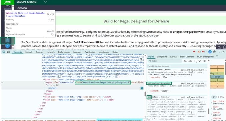
If you just open the Skin rule, (or the Inherited OOTB skin rule) you will see the corresponding CSS rule – px-default-pega-icons.css file referred in the ‘Additional Style Sheets’ section.
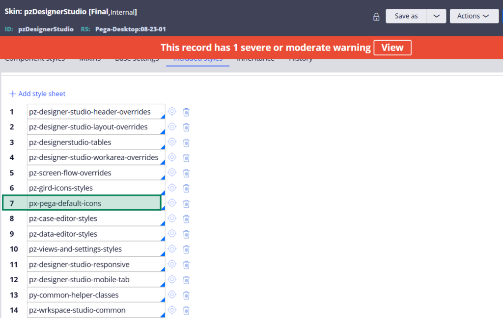
And this CSS rule holds the styling for the different icon classes.
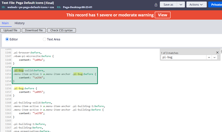
Remember the icon class configuration, there were two classes – pi & pi-bug-solid.
This is where the CSS reusability comes in the picture.
pi – full-form to Pega Icon. This CSS class holds all the base or reusable CSS stylings for all the icon classes.
You can find it at the start of the CSS rule. CSS styling for the pi class
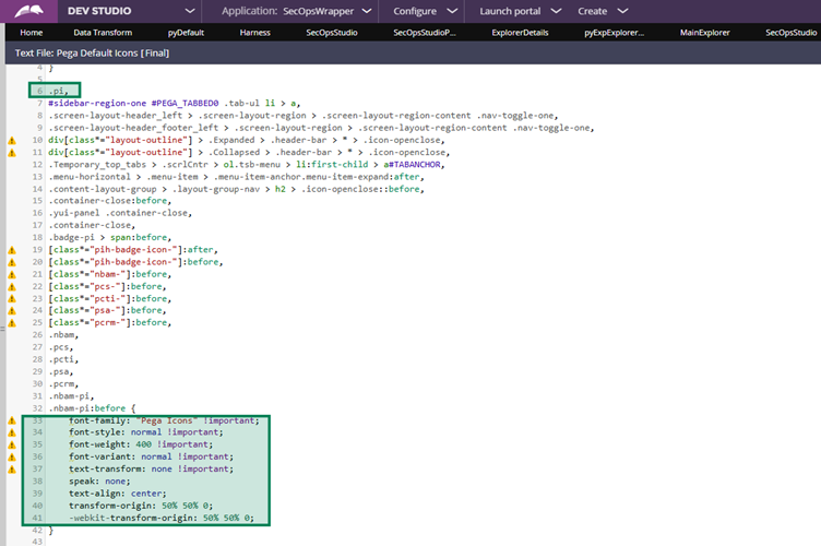
You will also find the same kind of CSS loaded for pi class in the browser.
Important Note: It is mandatory to follow the specific CSS class name format for pega icons. Always start with pi-<name>. In this tutorial, we will follow the same naming conventions.
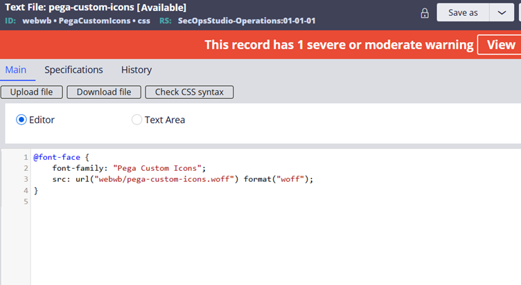
Finally, you will also note that at the very start of the text file rule, font-face references the uploaded font.
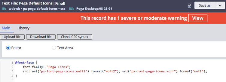
You note the format is woff2 with the name px-font-pega-icons.woff2 file.
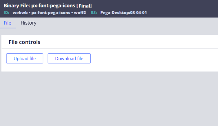
This is a binary file rule; you can easily find it.
Okay, now putting all these rules in order!
- Binary File rule – All the icons are loaded in the WOFF2 font file format and uploaded in the binary file rule.
- CSS Text file rule – The font file is referred and CSS styling was applied to the icons in a CSS text file rule.
- Skin rule reference – CSS text file is referred in the Skin rule, so that when the portal renders, it loads all the CSS styles in the browser.
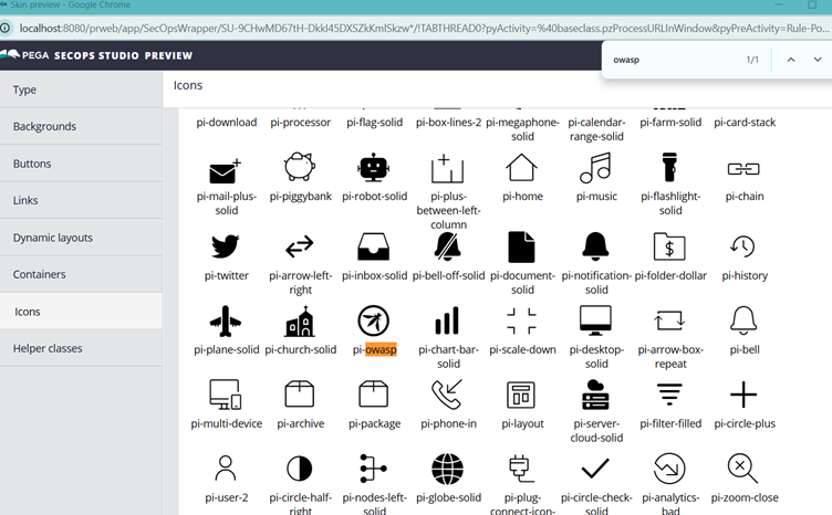
A quick tip – You can also quickly preview a skin rule to check all the icons as part of the skin rule.
4. Now you can refer to these CSS styles at different places in Pega UI elements.
We are going to execute all these 4 steps for our tutorial.
Before starting, let’s also get some basics about icon font classes.
We all know about fonts, right.. When you want to use any custom fonts, you will be executing the same kind of steps we saw before like uploading the WOFF2 files.
What is woff2 file format?
WOFF2 – Web Open Font Format 2 – A type of font format that is highly compressed, smaller in size, thus offering a faster website loading. Mostly all of the modern websites use this font format and is highly recommended for Pega applications.
Note: I already talked in detail about loading the custom fonts and woff2 file in the Pega constellation course lecture. I will not repeat the detailed description here. You can also easily browse about it on the internet.
At the end, Font renders the alphanumeric character for texts (like different forms of A, B, C) whereas the font icon is a specialised font file where characters are just replaced by vector symbols/glyphs. Here, pi-bug-solid can be referred to as the glyph loaded inside the font icon.
Let’s start this tutorial with the preparation steps
Create a new woff2 file including the custom icon for OWASP
Whenever you want to use some official custom font icons, look out for the official documentation to see if they provide any standard WOFF2 font files to refer in the websites. If not, you can go ahead with creating new WOFF2 file online.
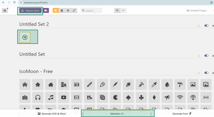
I will be using Icomoon. They already have a rich set of OOTB icons from which you can create a new WOFF2 file.
https://icomoon.io/app/#/select
But they don’t have an OWASP official icon. So we will simply download from the internet and import it inside icomoon site
Once imported, select the icon and click edit, where you can give a meaningful name to it.
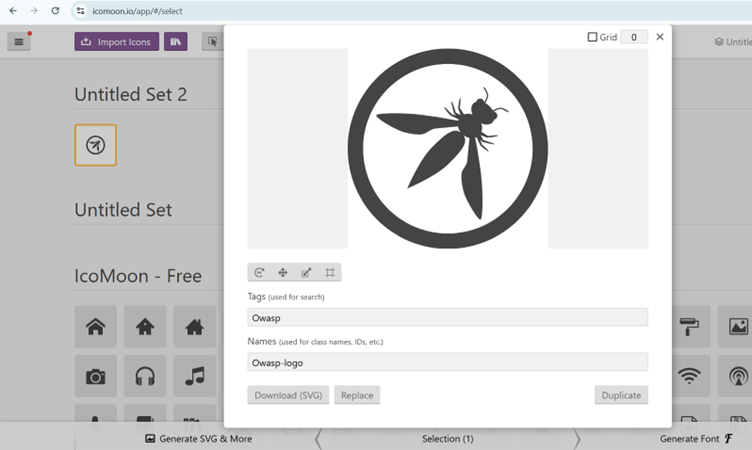
Then you can proceed to Generate Font.
Before proceeding to downloading font, make a note on the Unicode endpoint for the uploaded OWASP icon font – e900 (we will use this in CSS style reference)
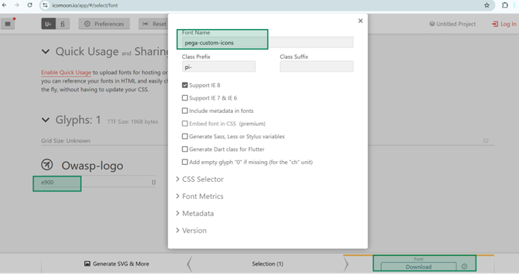
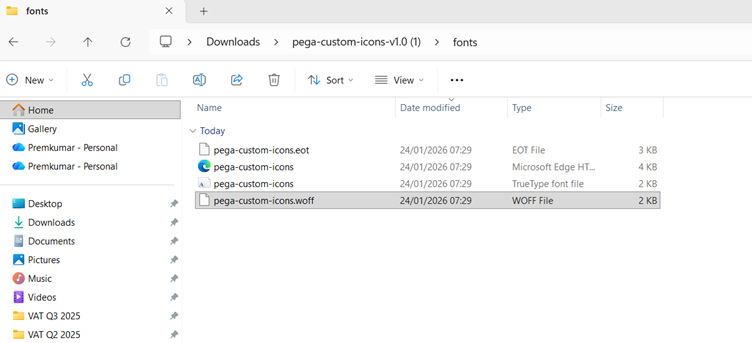
Download and extract the ZIP. You will find the WOFF file created with our font. Woff2 can be better, but this is also fine for now.
Our prerequisites are done. Let’s start with the actual steps inside the Pega designer studio.
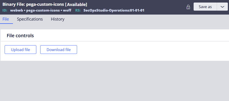
Step 1: Create a new Binary file
This is pretty easy. You simply go to the designer studio -> Technical -> Binary File and create a new rule.
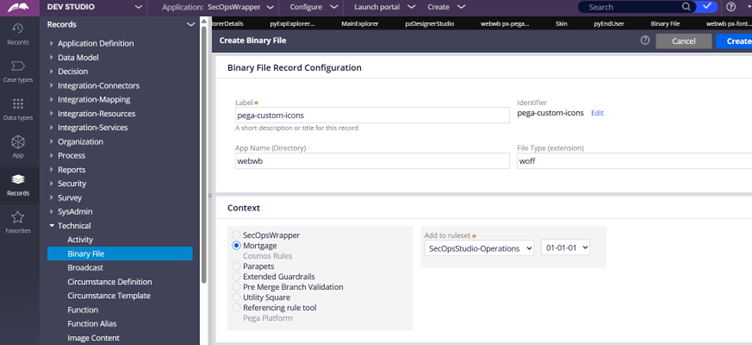
Then you can just upload the WOFF file and save the binary file rule.
Step 2: Create a CSS file and configure the styling.
Create a new text file rule of type CSS.
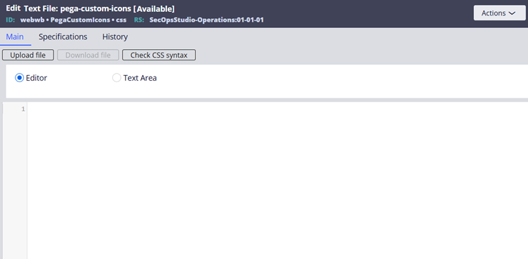
Step 2.1: Use the font face reference to the uploaded WOFF file.
Font family – you can give a meaningful name
Src url – you can refer to the WOFF binary file rule created in the previous step.
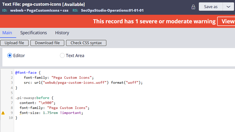
Step 2.2: Create a new CSS class and refer to the content
Start with a meaningful short class. I am using pi-owasp and you can use the before pseudo element.
Hope you already noted down the Unicode endpoint during the time of woff font file creation. Refer to it under the content attribute.
Tip: If you miss it or want to use existing WOFF file, don’t worry. There are a lot of tools in the internet which can help with analysing the font files.
Font-family – Use the same name which we used in the font-face
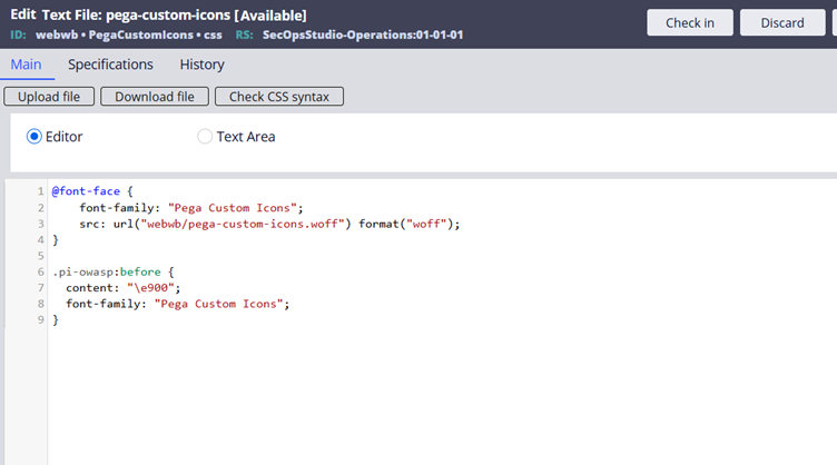
Save the CSS file.
You may wonder, where are the styling applied for these icons?? It will be applied from the CSS class .pi
What we will do is, we will refer to the icon class as ‘pi pi-owasp’. It means the icon will be using the reusable CSS styling configured in the OOTB pega icons CSS rule for the class ‘pi’. Hope you remember we discussed that in detail at the start of this article.
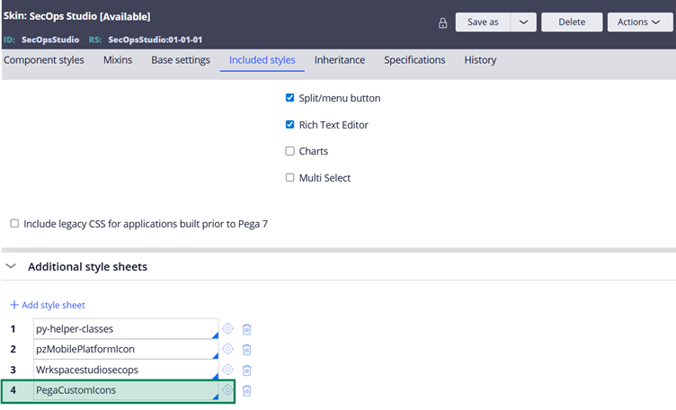
Step 3: Refer to the CSS file rule in the corresponding Portal skin and preview
Add the CSS style rule in the Skin rule. Do a Save and then click on launch preview.
You should see our new upload icon.
Now the final step
Step 4: Refer to the new OWASP icon in the SecOps studio.
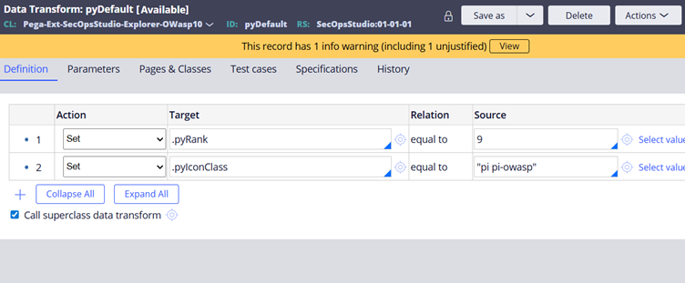
In my use case, I can simply update the class in the Data transform. In your use cases, you can update it in the right UI control for the icon class.
Do not forget to include the generic CSS class as well. In our case, it is ‘pi‘
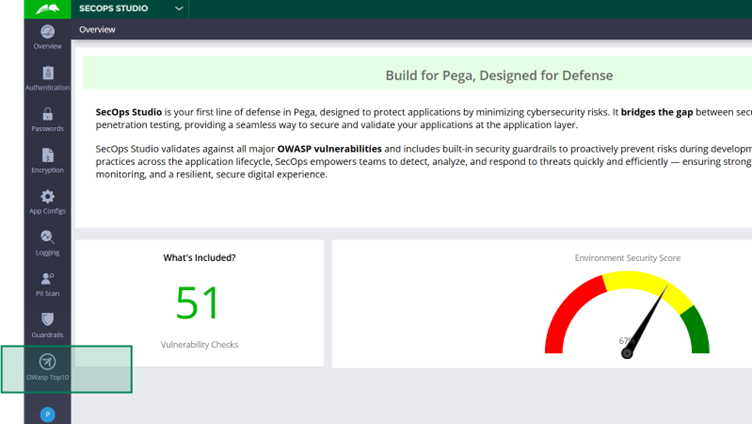
Now let’s do a quick test from the SecOps Studio portal.
Now this looks perfect, but maybe I need to increase the size a little!
I can do this by applying CSS style to the corresponding class
I will override to increase the font size to 1.75 times the root element size (rem)
Do a save and test the icon rendering.
Not sure if you recognise the change, but for me it looks best in real time.
We will end the lecture here. Hope you learned something new in Pega Traditional User Interface. See you in another blog article 😊