Dynamic Layouts – Usage and Configurations in Pega
In this blog article, we will focus on the HTML content part of the Pega application, specifically on the dynamic layouts, which is one of the most commonly used layouts in the section configuration.
Consider any application/website built over any programming language. The key building blocks on high level will be HTML + CSS + JavaScript
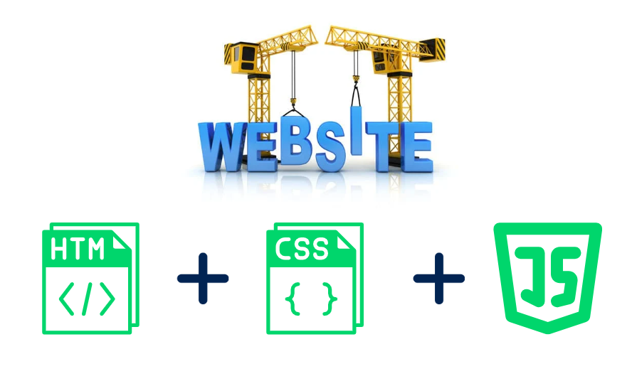
- HTML is responsible for the content of the application
- CSS is responsible for the styling of the application
- JavaScript is responsible for the dynamic content (like button click and other actions)
Of course for a Pega application definitely we need all these three building blocks.
But as always, Pega doesn’t want their developers to build everything from scratch like creating HTML files, CSS files etc.. Instead, they have some dedicated rules (low-code configurations) where you can configure those building blocks.
Pega HTML content – There are a lot of UI rules that contribute to building up the HTML content. Especially on the Section / View that includes different layouts and controls. Pega builds up the corresponding HTML tags.
Pega CSS Styling – Pega brings in the Core CSS styling of the Pega portals within the CSS styles included in the product, but also provides different low-code configurations that we can customize based on our needs. A Good example is the skin rule, where we can define different styling elements.
Pega JavaScript – Again Pega brings lot of JavaScript codes with their product. You may be aware of Constellation UI design which is entirely dependent on React JS. With Other design system, we do have some control over configuring the JavaScripts via text files.
Enjoying this content?
Access the author’s full video courses here at MyKnowAcademy.
Explore Courses →
Let’s deep dive into the HTML content part – HTML generation using section Dynamic layouts.
Pega 7 introduced many new features in the User Interface category. One of the main features is the introduction of dynamic layouts.
Every Pega application is made of two parts:
- Content – Supported by HTML rules
- Presentation – Supported by Skin rule
Note: HTML 5 is the fifth and current version of HTML standard.
All new Pega 7 application complies with HTML5 standard.
Applications prior to Pega 7 can be rendered in HTML5, by configuring in the application rule form.
What is a Dynamic layout?
We know that pega is a low-code app development tool and definitely you don’t want to create HTML files for your application for the UI screens. Instead, we will be creating certain UI rules like – Sections, Harnesses, and controls that can be converted to HTML tags on rendering in the browser.
Dynamic layout is one of the most commonly used layouts that helps to build modern, intuitive, user-friendly interfaces for the Pega application.
Inside the dynamic layout, you can arrange different UI elements like text inputs, labels, buttons etc.
Dynamic layouts can also nest another dynamic layout.
We also need to clear up one question!
One do we really need a layout in the section rule?
There are many reasons for this.
– It simplifies the developer’s work. Instead of writing raw HTML code, we can include a layout that can automatically generate <Div> tags and we can include fields inside the layouts.
– Helps to organize the UI and ensures consistency like you can have different layout formats which can be uniform across the application.
– Dynamic layouts are inherently responsive, as we also saw in the Skin blog article, where we can have control on layout responsive behaviour.
How do we include a dynamic layout in a section?
Step 1: Create or use any section.
Note: Whenever you create a new section, Pega places a new dynamic layout in the UI work area.
I will use the already created section ‘Create’
Step 2: In the toolbar, select Structural and Dynamic Layout.
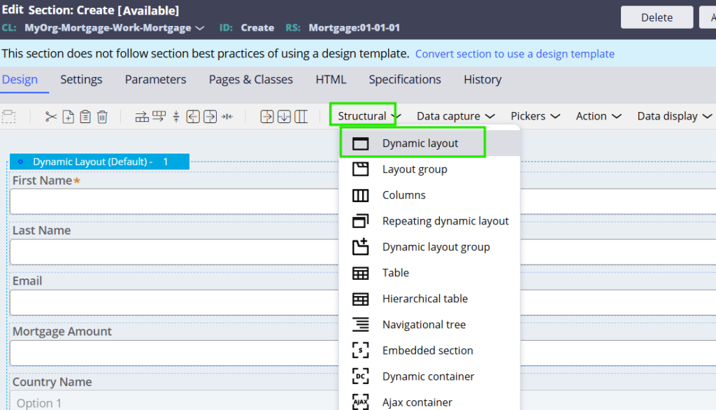
You can drag and place it inside the section rule.
Step 3: Then you can just keep adding fields, controls, layouts inside the dynamic layouts and build your UI screen.

It is important to understand the configuration of a dynamic layout. Let’s dig in deep to dynamic layout configuration.
Double-click on the dynamic layout.

There are 3 main tabs:
- General
- Presentation
- Actions
General tab
Layout format – This is a key presentation part that determines how a layout appears at the end portal.
These formats can be specified in the skin rule.
Please go through the blog article on Formats and Mixins where I explained with an example how to create a new dynamic layout format 😊
The commonly used formats are Stacked, Inline, Inline grid double etc.
You can also use ‘other’ to use your newly created format or other uncommon formats.
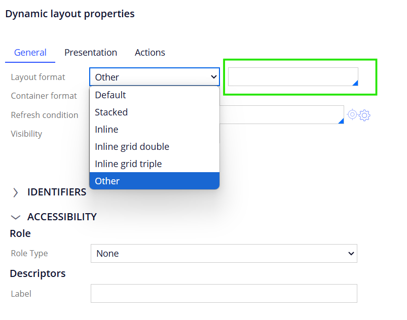
Let’s select the format as Inline and check the user portal.

You can see that all the fields come in the same line as inline 😊
The commonly used formats are shown below.
Container format –
We are able to select one of the container formats we specified in the skin rule.
With container formats we can specify the styling for header, body & outline of the dynamic layout.
You see there are around 8 Container formats (including the default one)
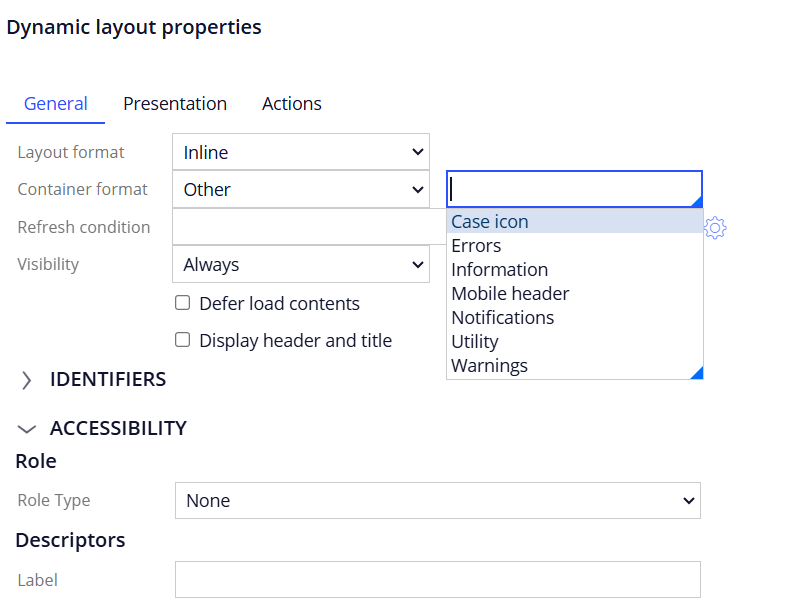
You will also see the same number of Component styles format for the Container in the skin rule.
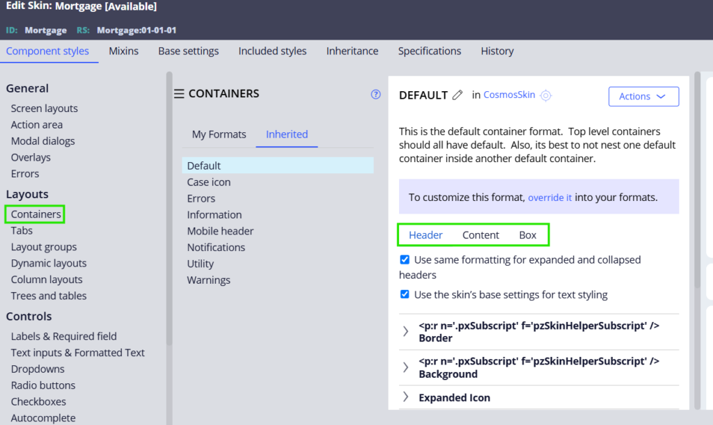
So in the skin rule, you can apply the styles for your container.
Let’s say as a business requirement, you want to style the content of only one of the dynamic layout as differently, then instead of applying the styles over the dynamic layout, you can create a new container and then apply the changes.
Later the container can be reused in other places if needed.
Just as a tutorial try out the following steps.
- In the Skin rule create a new Container format.
- Update the background colour to a strange colour.
- Now apply the same container format in the section layout configuration.
- Create a case and check the changes!
Refresh condition – You can refresh the layout based on the condition you specify.
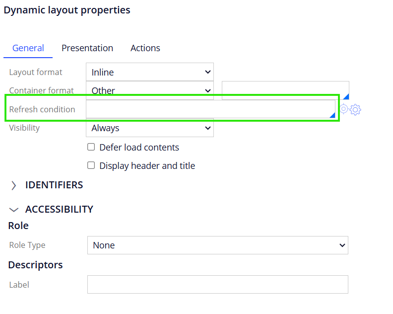
From the name itself, we can clearly understand that this layout can be refreshed based on conditions.
If you are a hardcore UI-Kit developer, most of the time, you will be using the Refresh section Action-Set when something changes and you want to refresh the entire section.
You can also consider this option to refresh only the layout when something changes instead of the whole section!!
When you specify a condition, then you also get 2 more options where you can either execute a data transform or an activity.
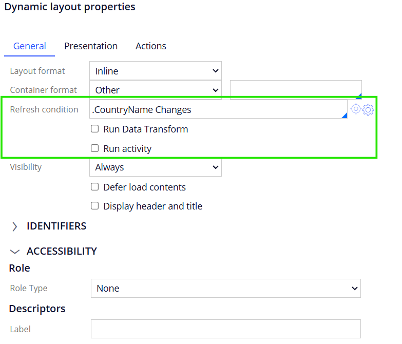
Visibility – You can specify the visibility condition for the dynamic layout.
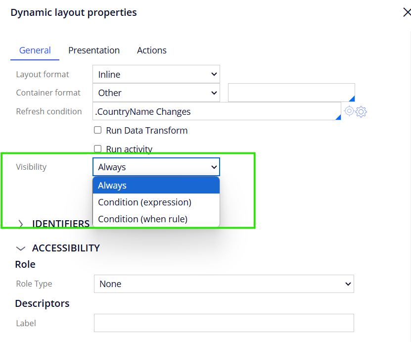
Always – It will be visible always.
Condition (expression) – Based on some expression returns true, the layout will be visible.
Condition(when) – Based on when rule returns true, the layout will be visible.
Note: When you specify an expression, you have the option to run the visible condition onthe client side.
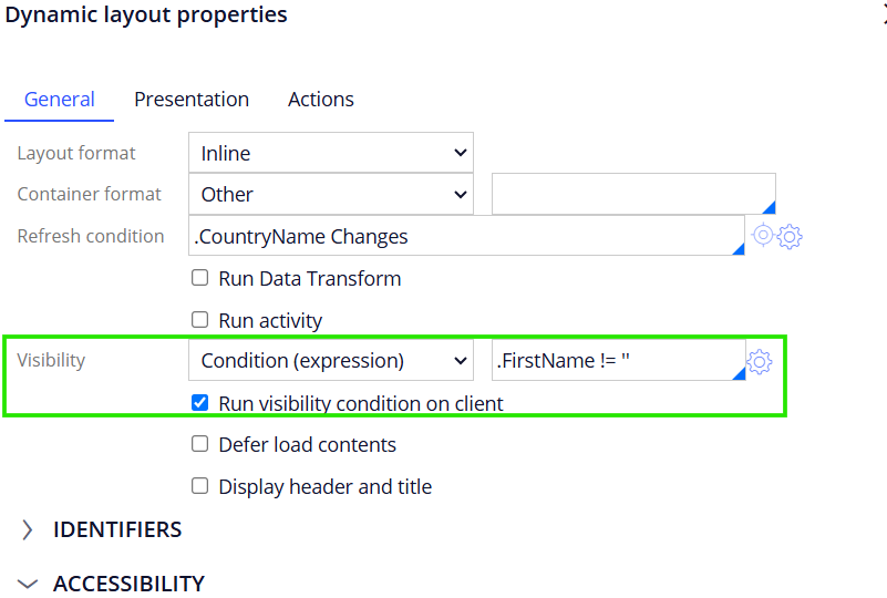
It means no server trip is required and the inbuilt Pega JavaScripts helps to run the condition in the browser side and so you will experience seamless visible conditions!
Defer load contents –
You have an option to defer the content loading. On selecting, you can specify a pre-loading activity.

Why do you defer a layout?
Imagine you are in an assignment flow action. You need to show some data, which is stored in external applications. Loading the external data can consume some time and can keep the current thread busy. But what if this data is not mandatory data needed to complete the assignment?
In such situation, we can just collapse the layout and use defer load contents. In the pre-loading activity, you can specify the connector activity to load the data.
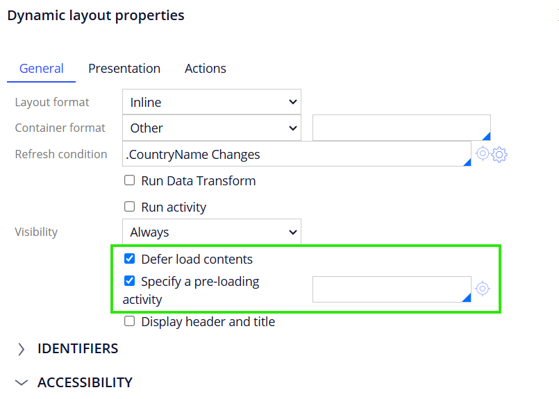
By this way, we will not have client render screen problems and the data will be loaded in asynchronous way in the user portal.
Display header and title – On selecting the checkbox, container settings box will be visible.
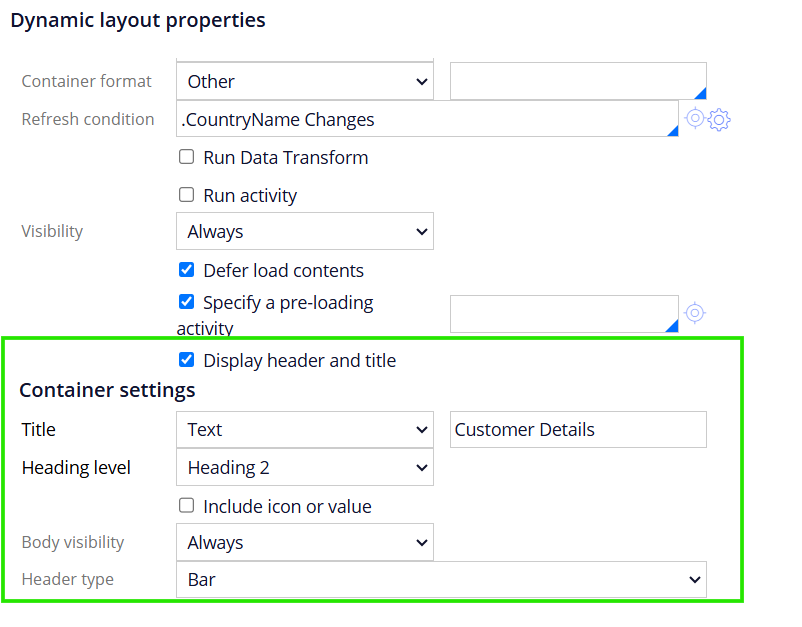
Title – You can refer to a text, property or a field value. I just mentioned it Customer Deatils.
You also have an option to specify the title using an icon.
Body Visibility – You can control the body visibility using expression or when rule, just like other normal visibility conditions for the entire layout body.
Header type – Bar / Collapsible / Fieldset.
Let’s mark it as collapsible and then we get a few more configurations!
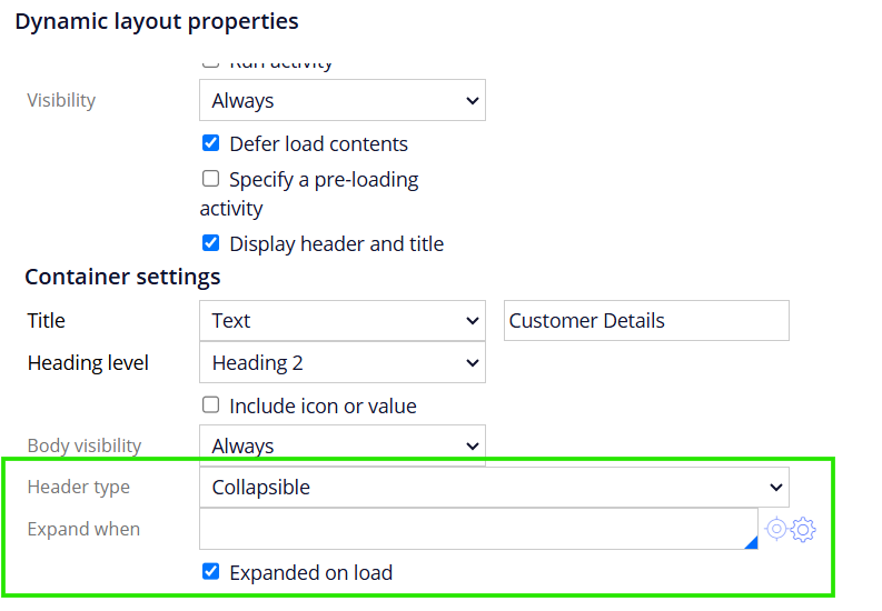
You can always expand on load by default or you can also configure a condition to expand by default. If you uncheck the expanded on load option, then the layout will always be completely collapsed.
Let’s check in the user portal

Presentation tab
Floats – This is an interesting aspect with a dynamic layout.
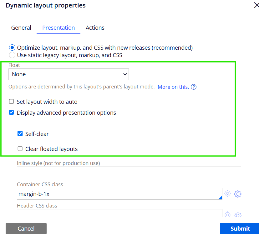
I already have an old blog article on Float, please go through it.
You have an option to specify Inline style or custom CSS class in the presentation tab.
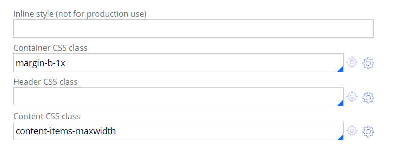
What are the differences between Inline style & custom CSS class?
a) Custom CSS class is introduced in Pega 7 and has several advantages over inline style.
b) Custom CSS class are reusable components and can be reused in any dynamic layouts. The inline style is not reusable. You need to manually add individual style.
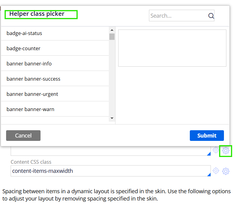
From the settings icon, you can already see custom CSS helper classes that come OOTB 😊
Actions tab
It is just like any other action tab of cell/layout configuration, where you can configure action sets to execute
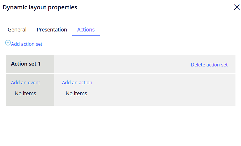
But normally in layouts, we don;t use it.
In Constellation we cannot even use it for any other UI elements 😜
Dynamic Layout formats
I already talked about this in the Formats and Mixins blog article that we can create or configure the Dynamic layout formats in the Skin rule.
What are the things you can configure in a skin rule?
Open Application skin -> Component styles -> Dynamic layout
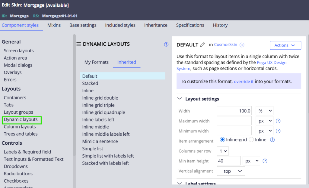
You can see a lot of inbuilt formats for dynamic layout.
Let’s finish this blog article by understanding the different layout format configurations in the skin rule
There are 4 important settings for a dynamic layout format:
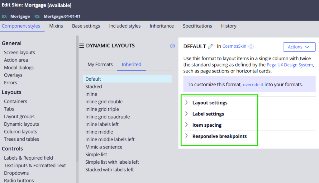
- Layout settings
- Label settings
- Item spacing
- Responsive breakpoint
Layout settings
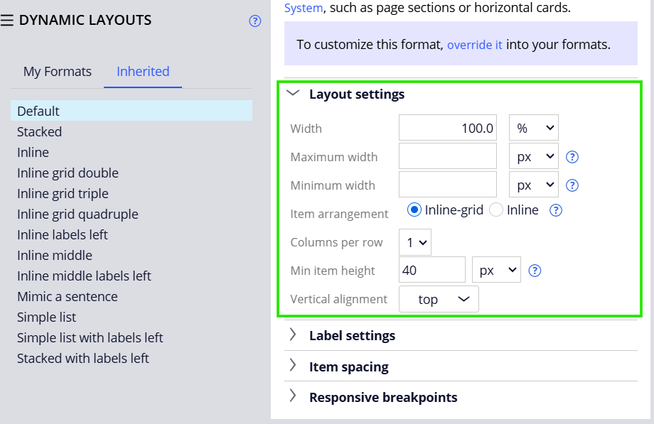
Width settings – You can specify either maximum or minimum width. Else, leave both blank.
For testing, I added maximum width as 50%. Click on ‘about this‘ to know about sample spacing 🙂
Item arrangement –
Since this is a stacked layout, inline grid – with columns 1.
Inline grid double – column per row =2
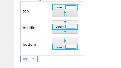
Minimum item height – You can specify the item height.
Vertical alignment – Top, middle, bottom. You can see from the picture how it will be aligned.
Label settings
Label position – You can set the label to appear top or left or none (not visible).
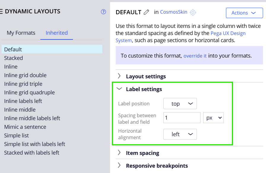
For testing, you can change the label to left and test it out 😊
Item spacing – You can specify the item spacing on all 4 sides or apply an uniform margin on all sides.

Note: This can be overridden by the spacing we specify in the presentation tab.
Responsive breakpoints
What is responsiveness?
Imagine, you need to access the pega application across all 3 devices – Laptop, tablet and mobile. This means the UI should be rendered properly in all 3 devices.
The pixels will vary for these devices. If the layout contains many fields and columns, then we can’t effectively see it on the mobile device.
Let us say, we have an Inline grid triple – It is clearly visible in laptop and tablet but won’t look good in mobile.
So, here we introduce a breakpoint. So on a certain pixel or a range, we can transform the layout to another format or hide the layout.
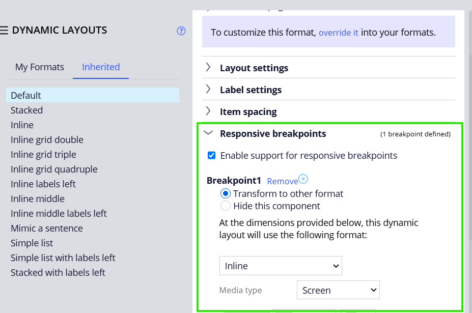
We can either transform to another format or hide the component. Now save the format.
Always remember to make use of the existing formats available in the SKIN rule. If there is some requirement which needs a different format, then go ahead and create a new format in the skin rule. Refer to the same in the section Dynamic Layout!
Hope you have become familiar with dynamic layouts now.


